Analysis of paired association
Scales of measure >> Descriptive statistic > Analysis of paired association >> Statistical inference
The description of the interconnection between phenomena and processes is a separate topic. So let us talk about it in more detail.

Dembitskyi S. Analysis of paired association [Electronic resource]. - Access mode: http://www.soc-research.info/quantitative_eng/6-1.html
According to the study of scientific publications in the most prestigious international journals dedicated to social and behavioural sciences (Charles Teddlie, Mark Alise, 2010), 77% of all sociological studies are conducted within the framework of quantitative approach. 71% of these are correlation studies or studies dedicated to the analysis of interconnection between social phenomena.
The simplest form of correlation studies is the research of paired associations or joint variance of two variables. This kind of research is applicable for two scientific objectives:
The simplest form of correlation studies is the research of paired associations or joint variance of two variables. This kind of research is applicable for two scientific objectives:
a) to prove the existence of the cause-effect relation between the variables (the existence of this relation is important, but it is not the only condition for the cause-effect dependence); b) to predict: if two variables are associated, then the value of one variable can be predicted with a certain level of accuracy if we know the value of the second variable.
Two variables are associated if a change in a category of one variable leads to a change in the distribution of the second variable:
Two variables are associated if a change in a category of one variable leads to a change in the distribution of the second variable:
Labour Productivity |
Job Satisfaction |
Total |
||
Low |
Medium |
High |
||
Low |
30 |
21 |
7 |
58 |
Medium |
20 |
25 |
18 |
63 |
High |
10 |
15 |
27 |
52 |
Total |
60 |
61 |
52 |
173 |
Labour Productivity |
Job Satisfaction |
||
Low |
Medium |
High |
|
Low |
50,0% |
34,4% |
13,5% |
Medium |
33,3% |
41,0% |
34,6% |
High |
16,7% |
24,6% |
51,9% |
Total |
100% |
100% |
100% |
It is easy to notice that, depending on the category of the variable "Job Satisfaction", the variable "Labour Productivity" changes its distribution. Therefore, we can infer that these two variables are associated.
This example also shows that several values of the second variable correspond to each value of the first one. Such relation is called statistical or probabilistic. In this case, the relation between the variables is not absolute. In our case, this means that in addition to job satisfaction, there are other factors affecting labour productivity.
When a single value of the second variable corresponds to a single value of the first one, we speak of perfect relations. However, even when we do talk about perfect relation, it is impossible to fully demonstrate them in empirical reality for two reasons: a) because of the error of measuring instruments; b) because it is impossible to control all environmental conditions affecting this relation. And since scholars of social sciences mostly deal with probabilistic relations, they will be discussed below.
Paired associations have three characteristics: strength, direction and form.
Strength shows how consistent the variability of two variables is. It can range from 0 to +1 (if at least one variable belongs to a nominal scale), or from -1 to +1 (if both variables belong at least to an ordinal scale). The values of 0 and close to it show the absence of relations between the variables, and values close to +1 (direct relation) or -1 (inverse relation) show strong relations. One way to interpret the relation from the standpoint of its strength is as follows:
Value |
Interpretation |
up to |0,2| |
very weak relationship |
up to |0,5| |
weak relationship |
up to |0,7| |
medium relationship |
up to |0,9| |
strong relationship |
more than |0,9| |
very strong relationship |
All values in the chart are given in the module, i.e. they must be analysed irrespective of the sign. For example, the relations of -0.67 and +0.67 have the same strength but opposite direction.
Relationship strength is determined with the help of correlation coefficients. To correlation coefficients belong, for example, Phi and Cramer’s V (nominal variables, few categories / tabular style), Gamma (ordinal variables, few categories / tabular style), Kendall’s and Spearman’s (ordinal variables, many categories), Pearson’s (metric variables, many categories).
Direction speaks of the nature of joint variance of the variables’ categories. If with the increase in the values of one variable the values of another variable are also increasing, then the relation is direct (or positive). If the situation is opposite and the increase in the values of one variable leads to the decrease in the values of another variable, the relation is inverse (or negative). Relationship direction exists only when we speak of ordinal and/or metric variables, i.e. those variables whose values can be ranked from lowest to highest, or vice versa. Thus, if at least one variable belongs to a nominal scale, we can only speak of relationship strength and form, but not its direction.
Relationship direction can be determined either with the use of contingency tables (few categories), with the use of the scatterplot (many categories), or with correlation coefficients (the number of categories of variables does not matter):
An example of a positive relation
2nd variable |
1st variable |
||
Cat.А |
Cat.В |
Cat.С |
|
Cat.А |
50% |
30% |
20% |
Cat.В |
30% |
40% |
20% |
Cat.С |
20% |
30% |
60% |
∑ |
100% |
100% |
100% |
An example of a negative relation
To correctly interpret the relation with the help of the tables, they need to be properly designed. So, in our case, Category A is the lowest value for both variables, and Category C – the highest.
2nd variable |
1st variable |
||
Cat.А |
Cat.В |
Cat.С |
|
Cat.А |
10% |
30% |
75% |
Cat.В |
20% |
40% |
15% |
Cat.С |
70% |
30% |
10% |
∑ |
100% |
100% |
100% |
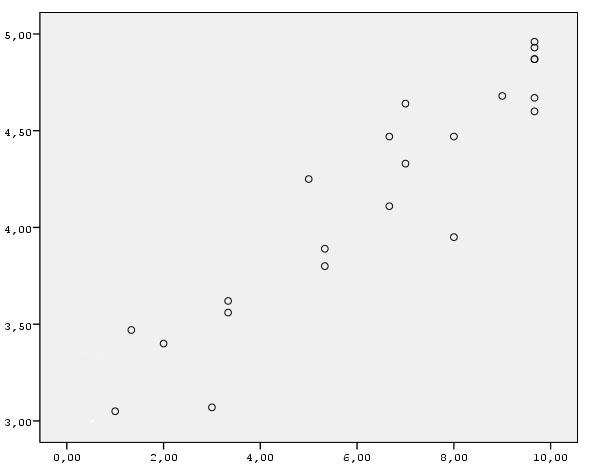
This diagram shows the relationship between the amount of effort applied by students in their learning (10-point ordinal scale, X-axis) and the success of their studies for the Bachelor degree (the mean value of their successful exam sessions for 4 years, Y-axis). Since the lower left corner corresponds to low values of both variables, and the upper right corner – to their high value, the diagram shows a positive relation between the variables. You can imagine how the scatterplot would look for a negative relation.
The calculated correlation coefficient has either positive or negative value, which in itself speaks of its direction.
Despite the fact that the correlation coefficient’s value is sufficient to obtain basic information about the relationship between the variables, its calculation is usually preceded by the construction of a table or a scatterplot, which are necessary to obtain additional information, in particular – about relationship form.
Despite the fact that the correlation coefficient’s value is sufficient to obtain basic information about the relationship between the variables, its calculation is usually preceded by the construction of a table or a scatterplot, which are necessary to obtain additional information, in particular – about relationship form.
Relationship form shows the peculiarities of joint variance of two variables. Depending on the scale to which a variable belongs, relationship form can be analyzed using a bar graph / contingency table (if at least one variable is nominal) or using a scatterplot (for ordinal and metric scales).
Here is an example. In one of my studies, whose units of analysis were two departments of different universities, I found that the relationship strength between the variables is 0.83 in both cases (students’ type and their successful last session were taken as variables). Thus, relationship strength and direction were similar for both universities. However, relationship form showed essential differences (click to enlarge):
Here is an example. In one of my studies, whose units of analysis were two departments of different universities, I found that the relationship strength between the variables is 0.83 in both cases (students’ type and their successful last session were taken as variables). Thus, relationship strength and direction were similar for both universities. However, relationship form showed essential differences (click to enlarge):
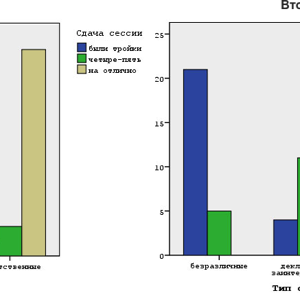
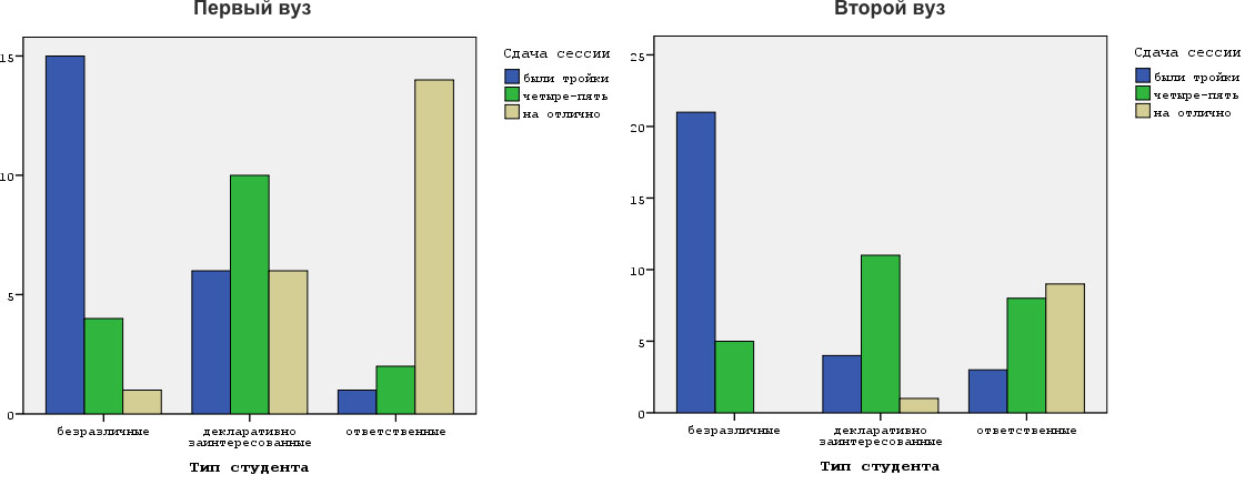
The differences in the form of distribution are obvious. Apparently, it is much easier to study at the first department than at the second. This, in particular, is indicated by the number of students who passed their exams with excellent marks.
Scatterplots provide more analytically valuable information – in addition to the comparison of different units of analysis, they allow us to estimate the relationship’s deviation from linearity. Linearity is an important prerequisite for the effective use of correlation coefficients and many other statistical methods. It is observed when each new increase in the value of one variable by 1 leads to the increase in the values of another variable by the same or approximately the same value. Thus, for the above mentioned scatterplot, the increase in the value of the 10-point scale by 1 leads to the increase in students’ success by the value close to 0.2.
When the relationship between the variables is sufficiently close to the ideal linear model, correlation coefficients adequately reflect its strength and direction (in the scatterplot presented earlier, the strength is equal to 0.93). Otherwise (i.e., with nonlinear relations) special methods of data analysis must be applied. The following scatterplot is an example of a curvilinear relationship:
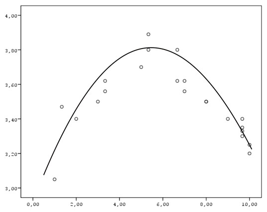
This relationship form may occur, for example, between students’ anxiety and their success at the exam, when excessively low or excessively high anxiety lead to reduced success.
To sum it up, I would like to mention one important point: the analysis of relations in terms of their strength, direction, and form is only the first step in the analysis of pair associations. Once we have determined that the relationship is of scientific or practical interest, it is necessary to test its statistical significance, because the existence of the relationship in the sample does not mean that it is present in the population. Such problems are solved with the methods of statistical inference, whose specifics are considered below.
To sum it up, I would like to mention one important point: the analysis of relations in terms of their strength, direction, and form is only the first step in the analysis of pair associations. Once we have determined that the relationship is of scientific or practical interest, it is necessary to test its statistical significance, because the existence of the relationship in the sample does not mean that it is present in the population. Such problems are solved with the methods of statistical inference, whose specifics are considered below.
- default_titleХили Дж. Статистика. Социологические и маркетинговые исследования. - К.: ООО "ДиаСофтЮП"; СПб.: Питер, 2005. - 638 с.
- default_titleБююль А., Цефель П. SPSS: искусство обработки информации. Анализ статистических данных и восстановление скрытых закономерностей. - СПб.: ООО "ДиаСофтЮП", 2005. - 608 с.
- Show More